We have been asked to design a music magazine, with our own original idea’s. It has to have a selected genre to work around and I have chosen alternative. There needs to be at least four original images. We need to create a front cover, contents page and a double paged spread.
My media product uses conventions of a real music magazine because it includes a large masthead of the magazine name which is ‘loud’ I chose this as my titles because it connotates my music genre been loud music, I also got the idea for this from when we researched 3 different music magazines in our chosen genre. Kerrang’s slogan is ‘live life loud’ so this influenced my music magazine name. I kept a steady house style of Red, gold black and white on the front page, contents page and double page spread, the red could suggest that the magazine is more about the artists gossip because red
is the colour used in tabloid newspapers for example the sun, and that is about gossip. Because I have kept a constant house style this makes the pages I have created more professional. I have kept the continuity by the background been white on all off my pages not including my front cover, and the house style added to the strength of continuity. As any other magazine I have a variety of features on my contents page. I included puffs on the double page spread to promote Worthless Jay by asking the audience to follow her on twitter, tumblr, YouTube and facebook this could also be seen as synergy because its promoting the magazine and the artist. This links in with the audience of the magazine because the target audience will most likely use one of these social networking sites. Of course I included a barcode on my front cover because as all successful music magazine and placed it in a corner just like on a magazine. Another reason I included a barcode is because you can not retail a magazine without a barcode.
is the colour used in tabloid newspapers for example the sun, and that is about gossip. Because I have kept a constant house style this makes the pages I have created more professional. I have kept the continuity by the background been white on all off my pages not including my front cover, and the house style added to the strength of continuity. As any other magazine I have a variety of features on my contents page. I included puffs on the double page spread to promote Worthless Jay by asking the audience to follow her on twitter, tumblr, YouTube and facebook this could also be seen as synergy because its promoting the magazine and the artist. This links in with the audience of the magazine because the target audience will most likely use one of these social networking sites. Of course I included a barcode on my front cover because as all successful music magazine and placed it in a corner just like on a magazine. Another reason I included a barcode is because you can not retail a magazine without a barcode.
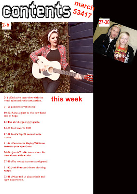
On my front page I have a banner headline which is about the main story in my magazine. I have lots of strap lines on my contents page underneath the page numbers and the name of the page, these tell the audience a really brief summary of what that page will be about. On the front cover I used one main image of my main story which filled the full page so it stood out. All the text was neatly towards one side and readable. I added addtional text at the top of the page to show what other bands were in the magazines.On the other hand on my contents page I used 5 photo’s what linked in to the stories inside of the magazine but still kept the main story photo been the largest and main focus on the page. I split the contents page into different sections one section for reviews and one for the features, just like I had seen when I researched the other magazines. On my double page spread I used three main original photo’s of the artist I made the photos the main focus on the page by putting them right in the middle. I made sure that if I had to fold my magazine in half non of the text or photos would have a crease down the middle. Conventionally as any other magazine I included the magazines website. I have included a exclusive on my front cover which you usually find one some music magazines on a big story, this will help the certain magazine sell because a exclusive is only a story what one magazine can cover in detail.
My media is targeted at teenagers from aged 15 to late twenties. I have represented this teen audience by using a teen artist to be my main cover and main photos on my magazine. It represents how you can achieve a goal from such a young age and still be a normal person and it shows that not all teenagers are as bad as the media puts across, despite if you are a record selling artist or a normal teen. On my contents page I advertised a chance to win tickets for Leeds festival which will attract the teen audience. Also the big exclusive across the front of the front cover could maybe attract the audience because it attracts their attention and makes them want to know the 'gossip' first. Which is what teenagers are usually like. On the double page spread I have used advertisements for social media, so the teen’s might want to ‘follow’ the artist on them certain websites.
I think that Bauer Media might distribute my magazine because It currently doesn’t publish a magazine in my genre of music targeted at 15-24 year olds. Which means I can compete against other magazine distributors like IPC media which also produces the same music genre as me. IPC owns NME magazine which has a audience of 70% males. So to make more people buy my magazine I shall include things in it which can make the audience 50% females and 50% males. Then I will have more of a chance of people buying my magazine rather then NME.
The audience for my media product would be primary targeted at males because there is more male bands in my magazine, but females would be the secondary audience. The age range would be teenagers from 15-21 because that’s when you are more likely to be listening to different music and will be able to afford the magazine monthly because you’re still living at home with your parents who are going to give you pocket money to spend things on luxuries/things you don’t need like magazines. The SEG for my media product will be C1-E because its not the type of music for professional business people to listen to, that would most likely be a classical music magazine. Just like the nme magazine I have a reader profile of people what have read my magazine.
-reader profile
Male: 71%
Female: 29%
Median age: 22
Student: 56%
Abc1: 34%
Ciculation: 34,975
Readership: 320,000
I tried to attract my audience by making sure that the artist(model) looked like she belonged in that genre of music. I chose to have a female solo artist because this is different and represents that females can be successful to.
I made sure I chose the right costume to fit into the music genre I did her makeup so she had big black eyes and dressed her like a indie stereotype. Three quarter demin trousers , Converse shoes because these are American shoes what represent the rock genre. a plain top and a checkered shirt because bands are usually seen in checkered shirts, males and females. I did her hair big and back combed to represent the genre of music, and her makeup was all black to give her the rock chick look. I only used one prop for the photoshoot,which was a guitar and made her look like she was playing it. The location I chose was not like it would be on a mainstream magazine, with all white backgrounds. I chose to put her in a garden, which she would look individual and I thought It would make the photographs look a lot more interesting for the audience.
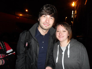
Not all of my photographs where taken with the artist, I went to some concerts and used the photo’s from them, these are a lot more interesting and real then the ones I had taken for my media. I took a lot of different shots so that the audience are not just looking at the same ones. I took some against a white wall then some in a different setting outside. I took some long shots, which I was planning to put on my front page. I took some mid shot and high shot photos for my contents page then some close up photos for my double page spread, I choose to use close up photos because this showed the artist close up just like the article on the page to. It also shows the audience how fun the artist is.
I have learnt about technologies from the process of constructing my product. I have progressed at using Photoshop to make my magazine look more professional. Things that you couldn’t do on paint like add new layers, rub out things via using the wand tool, and move layers around. I also learnt so scale photos which meant not making a photo look squashed. I used the ruler tool to line up my text to make it look neat. I also learnt how to use different settings on my camera to create different scenes for the photos. In the images below are examples of the tools i used on photoshop. The first one is the lasoo tool. Which selects a area then if you selected the rubber tool it would only rub out in this selected area. The second one is the ruler tool. And the third picture is the transform tool.
Looking back at my preliminary task, I think that I have progressed by improving on my knowledge off terminology for example the names of conventions on a magazine (masthead, Socio-economic groups, byline, synergy, strap line) and what is needed to attract the right audience of the right music genre. I have progressed by practising alot on Photoshop and learning the different tools.
After creating my magazine I created a tick box questionnaire to ask ten people in my college what page they liked better the front page contents page or double paged spread then I created a table to show my results. My target audience who I asked the questions to were 16-18.
What page do you think was better quality?
What could I improve on?
Would you buy my magazine?
What genre do you think the magazine is?
On a whole what would you rate my magazine out of 1-10?
In summary I found that i had met my breif by impressing my target auidence with the magazine because my target auidence was the people who i asked to take my questionare. The biggest improvement what i got from my feedback was changing the layout. But on the other hand my magazine didnt get rated lower then a five and the auidence guessed the correct genre of my music magazine which means i had done something right and my auidence said my contents page was the best quality which i agreed on. 100% of my selected people to do my questionare said they would buy my magazine.


