My second go at taking images...
I decided to change the images because of the poor quality of my first photos. I decided to plan the photoshoot and spend more time on it.
front cover possible photos
i didnt choose this as the front cover because she is not looking at the camera.
i didnt choose this as the front cover because she isnt looking at the camera.
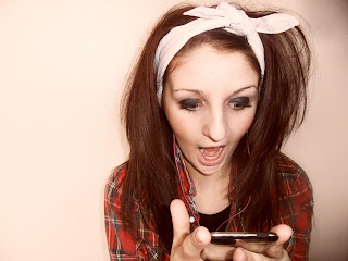
i didnt choose this for the front cover because she isnt looking at the screen.
i thought this was a good photo and the effect worked well but the artists face wasnt appealing.
i did not choose this as my front cover because the models eyes are shut
i thought this photo would of worked well on the front cover because i liked the angle of the guitar,but the artist looks like she doesnt have a neck.
i didnt choose this as my front cover because the artist was looking away from the camera.
this was my choosen front cover because i thought it flattered the artist. Included her full outfit and her musical instrument.
contents page possible photos
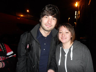
i didnt choose this to go on my contents page because it was took at a concert and somebodys hands are in the way.
i choose this for the contents page because it links in with one of the stories.
i choose this for the contents page because it links in with one of the stories and its a good picture.
i didnt choose this because the image is to dark.
i didnt choose this because the camera angle is titled.
i didnt choose this because of the peoples hands in the way.
i choose this photo because it links in with the storie and is a good photo.
i didnt choose this because it didnt link in with any of my stories.
i choose this as my contents page main photo because i like the affect and it shows her in mid play.
i didnt choose this because the artist is not looking at the camera.
i didnt choose this because the artist looks out of place.
i didnt choose this because she is not looking at the camera.
i didnt choose this because the artist looks to small compared to the setting.
i didnt choose this because i thought it was to much of a dark colour affect.
i didnt choose this because the twigs are in the way of the artists face.
i didnt choose this because the artists face isnt in the picture because it didnt go to plan.
i didnt choose this because the artist looks to small.
i havent choosen this as its not a good photo.
double paged spread possible photographs.
i choose this because it is a random photo and shows that she is a fun artist.
i chose this because it links in with music as she is holding a ipod.
i didn't choose this one because she isn't looking at the camera.
i didn't choose this because she isn't looking at the camera.
i choose this because its not boring and i want it to look like the artist is having fun.
i didn't choose this because she looks like she is in mid talk.
i didn't choose this because although she looks like shes having fun she isn't looking at the camera.
i didn't choose this because she is looking away from the camera.
i didn't choose this because of how her eyes look they look like she is about to shut them.
i didn't choose this because she is looking away from the camera.
My first go at taking images.
These were my first images what i was going to use for my music magazine,but after making it me and my teacher decided that i should take my pictures again because the ones below were not good quality and wouldnt work in a music magazine because it looks really rushed. I didnt spend enough time on them,so took more time to plan another shoot.


No comments:
Post a Comment